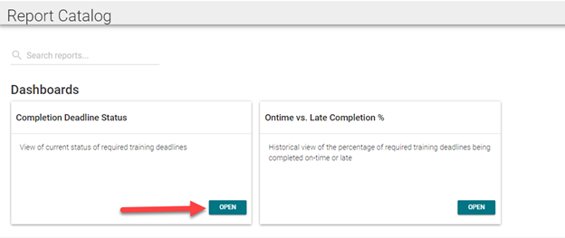
From the Report Catalog, select the dashboard you wish to view and click the Open button.
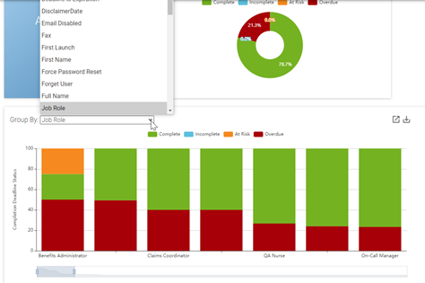
The dashboard will open to display widgets that contain information based on learner data. The Completion Deadline Status dashboard displays:
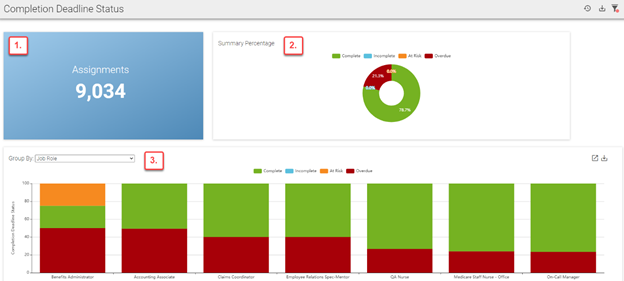
*At risk assignments are determined based on assignment due dates and are client-specific. Users can define which assignments are at risk by specifying a certain number of days before the due date. For example, a company may consider an assignment to be at risk if it is not completed two days before the due date.
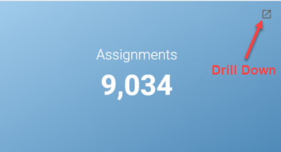
Each widget on the dashboard has the ability to "drill down" data to show more detail. Click the Drill Down icon in the corner of the widget to open a new tab that will display additional learner data in the form of a chart.
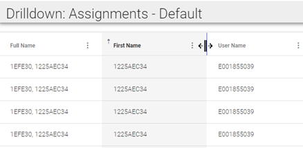
Data fields in the chart will vary based on client preference. Each field can be used to sort the data. Click the three vertical dots (ellipsis) next to any field you wish to sort the data by. Each column can be sorted in ascending or descending order.

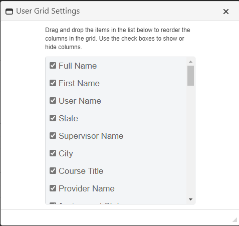
To add or remove fields from the chart, click User Settings. Check all boxes from the list that you wish to include in the chart. To remove a field from the chart, uncheck the box. Click and drag a field to move its location in the chart. Drill Down preferences, such as hidden and visible columns, will be saved per user/dashboard.
To resize columns, place your cursor over the space between two columns until the cursor icon changes to a vertical line with an arrow on either side. Click and drag the cursor to adjust the column size.
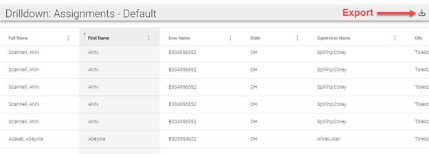
You can also click the Export icon at the top right corner of the Drill Down screen to export the data to Excel.
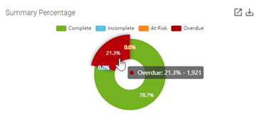
The Summary Percentage widget displays the percentage of all required training assignments by status (complete, incomplete, at risk, or overdue). Place your cursor over a section of the graph to reveal the numerical value of the percentage shown. Click a section of the graph to open a new tab that displays data for each assignment that falls under the selected category.
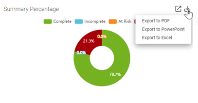
You can click the Export icon to export the data from this graph into a PowerPoint, Excel, or PDF file. The Export icon is available for most dashboard widgets as well as the dashboard itself. See Dashboard Toolbar for more information on exporting dashboards.
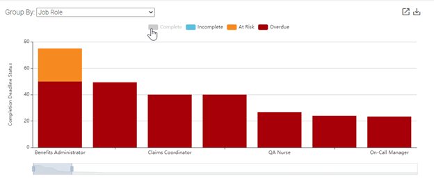
To view complete, incomplete, at risk, and overdue assignments by group, click on the drop-down box in the Group By widget and make a group selection. The bars in the graph are sequenced from greatest to least according to potential areas of concern (incomplete, at risk, and overdue).
Like the Summary Percentage widget, you can place your cursor over a portion of the graph to see the numerical value of the percentage shown. You can also drill down and export this information.
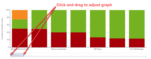
NOTE: If you have more data fields than will fit on your screen, an adjustment bar will appear below the bar graph. You can click and drag the handles on the adjustment bar to change the width of each bar within the graph. This will allow more or fewer bars to fit on the screen. You can click and drag anywhere inside the adjustment bar to manipulate which areas of the graph are visible on the screen.
If a graph has a legend, you can click any of the categories to turn them off. This removes the data related to that category from the graph and draws attention to areas of potential concern. Click the category in the legend again to add the removed data back to the graph.
On-Time vs. Late Completion % Dashboard